BREaK
Branding / Print
TypeCon is an annual conference dedicated to
type and design and presented by the non-profit Society of Typographic Aficionados (SOTA). The
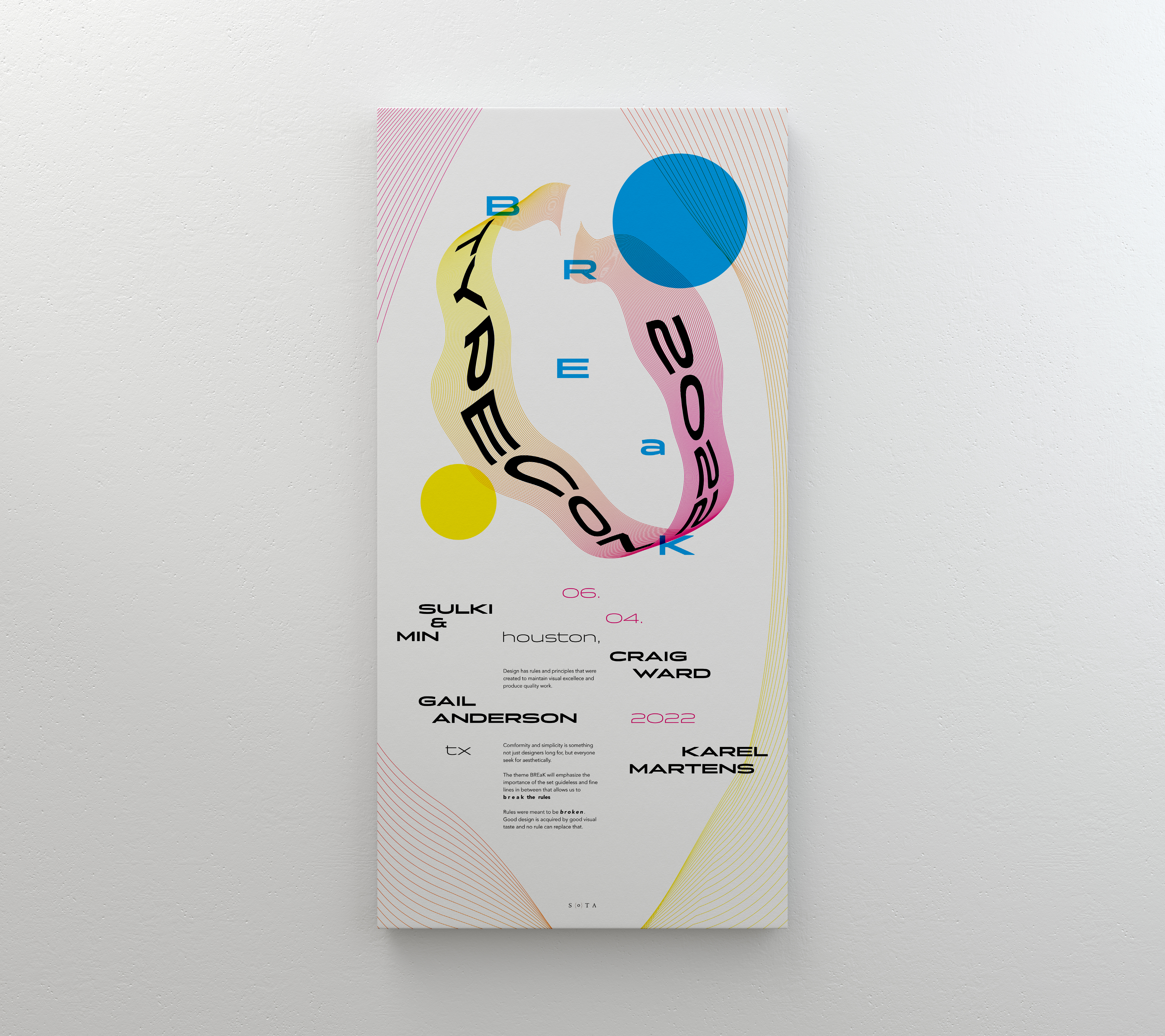
theme of BREaK was created as a team to
represent the boundaries and rules that must be broken during the
iterative process of design to arrive at great ideas.
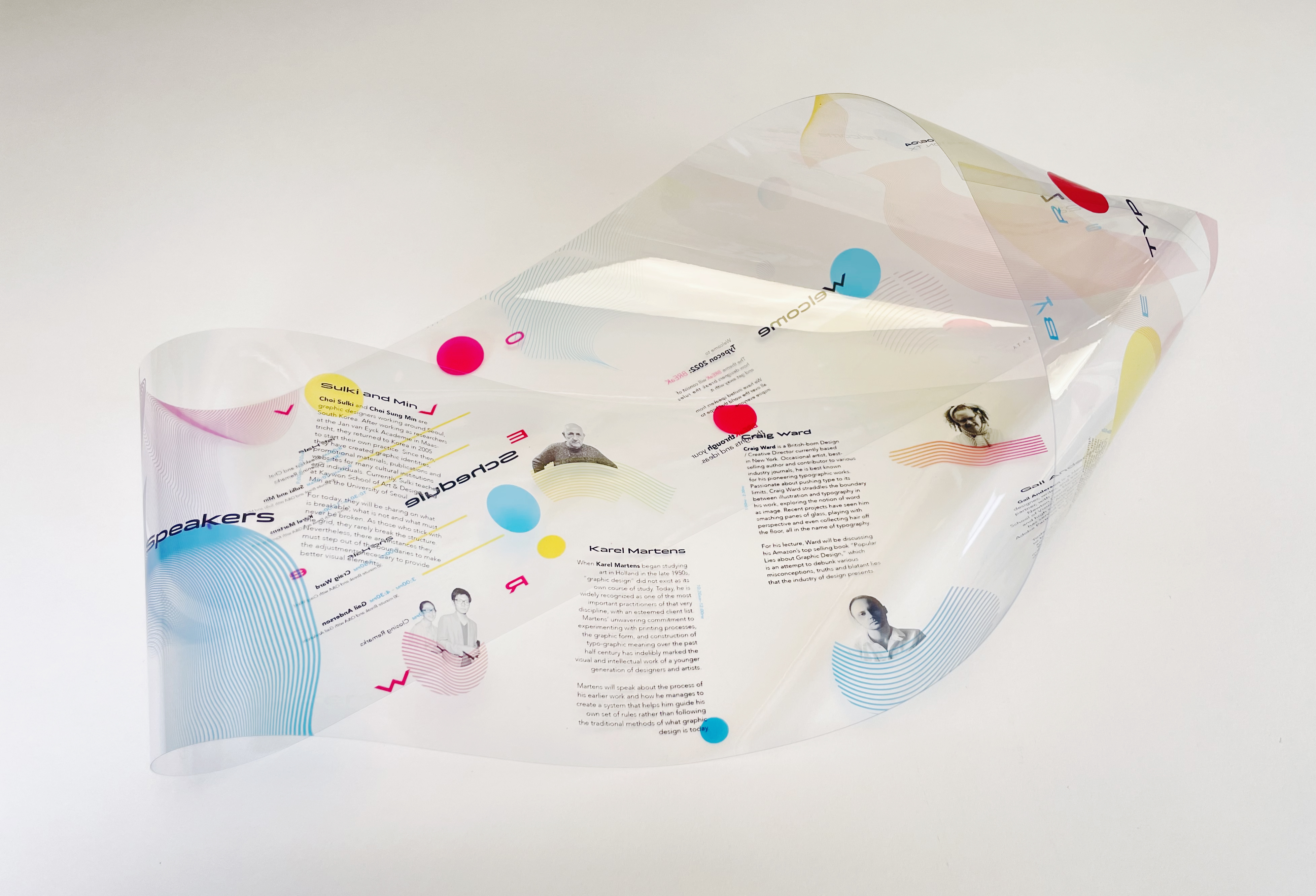
The broken mobius strip is utilized as a repetitive element and signifies the breakage in a continuous and infinite
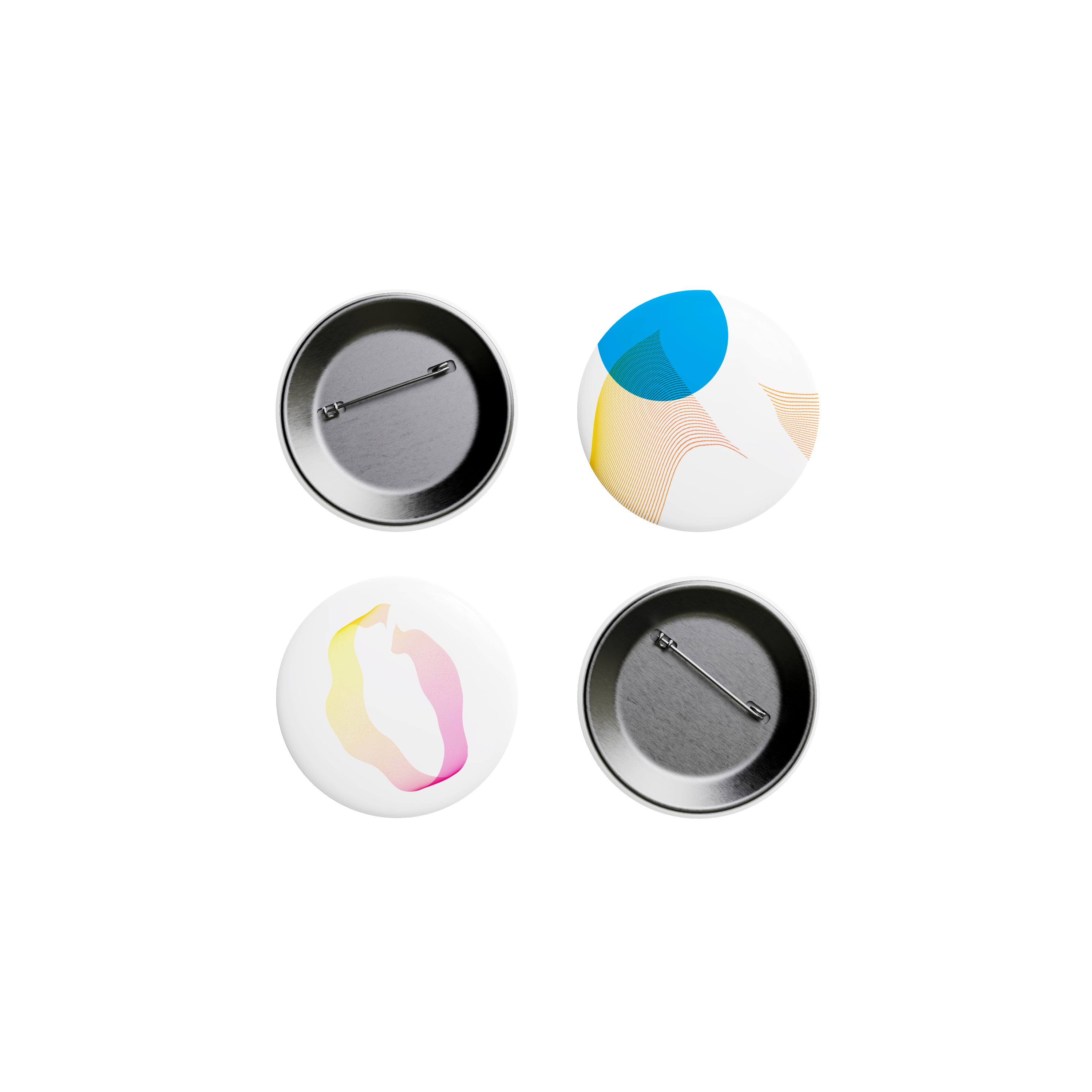
loop. The CYMK color scheme with the overprint elements
points to the base colors of printing. The gradient in between the colors represents abundant connections that are overlooked.


